

UI blocks
Browse the Cintesa UI blocks library, add a block to a content section, and change a landing hero layout without starting over.
Last updated on
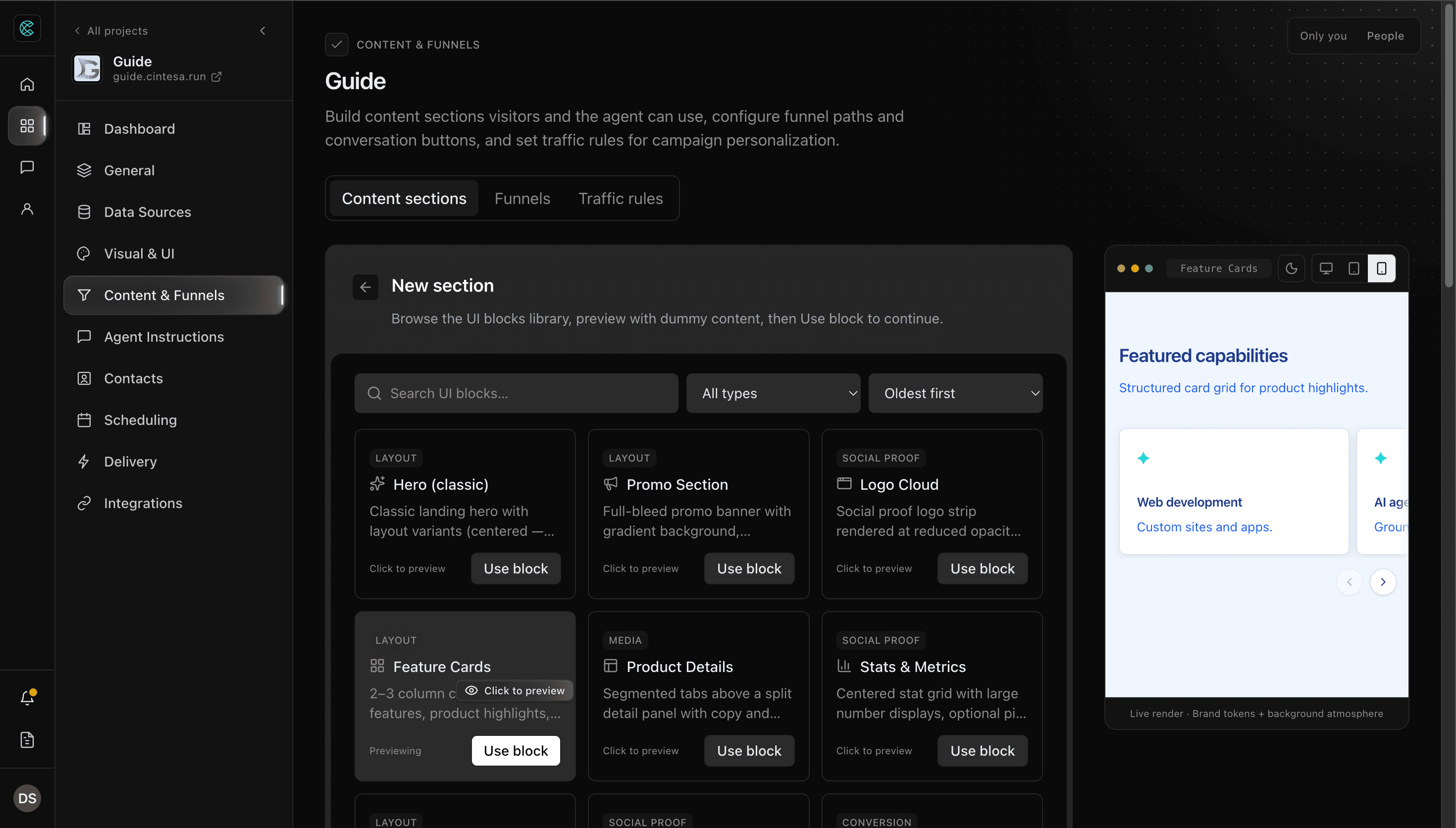
A UI block is a visitor-facing layout you place on a content section. The library is the catalog of those layouts — landing heroes, cards, media, forms, and the other packaged shapes.
Open Content & Funnels → Sections. You pick a block when you create a section, and you can add more blocks to a section later. Theme colors and type come from Visual & UI. First-viewport background is Atmosphere on the landing hero, not a separate block.
Some blocks also appear in a conversation reply when Agent Instructions ask for that shape. Type @ and pick the block so the spelling matches. Prefer a saved section (@page_section:) when the layout and copy already live in Content & Funnels.
Add a block
The same library is used for a new section and for Add block on an existing section. Preview uses dummy content so you can judge the shape before you commit.
New section
- Open Content & Funnels → Sections.
- Click New section.
- Search, or narrow the list with All types (Layout, Conversion, Social Proof, Media) and Sort by.
- Click a card to preview it. Use the desktop, tablet, and mobile controls on the preview.
- Click Use block to continue into the section editor with that first block.
- Fill the fields, set language and landing visibility, then save.
Click Back if you are still browsing — nothing is created until you continue and save.
Add block on a section
- Open a content section.
- On UI blocks, click Add block.
- Browse the same library. Click a card to preview, then Use block to append it.
- Reorder with move up or down, duplicate, or remove as needed.
- Save the section.
Closing the Add block panel without Use block leaves the section unchanged.
On a Funnel conversation button you can also attach library blocks from that button’s settings. Those blocks still come from this catalog.
Plan-related feature. Generate content with AI on a block is available on Pro or higher. You can still author every field by hand on every plan.
Change a landing hero layout
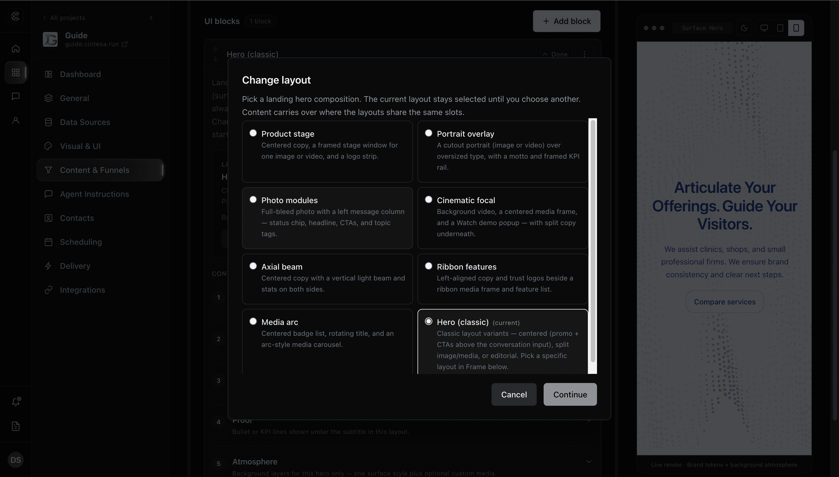
Change layout lets a project that already has a landing hero switch to a different hero composition in place. Shared copy and media that fit the new layout carry over. The section does not gain a second hero block, and you do not start from a blank hero.
Use it when the current first viewport is the wrong composition — for example Hero (classic) when you now want Product stage — and you want to keep the headline, buttons, and other shared slots.
- Open the landing hero section in Content & Funnels → Sections.
- Expand the hero block. The studio shows the current layout name and a short description.
- Click Change layout.
- Pick another composition. The current layout stays selected until you choose a different one.
- Click Continue.
- Review Carries over and Won’t carry over. Confirm only after you accept that list.
- Click Change layout. The block updates in the same place in the same section.
- Check the preview, then save the section.
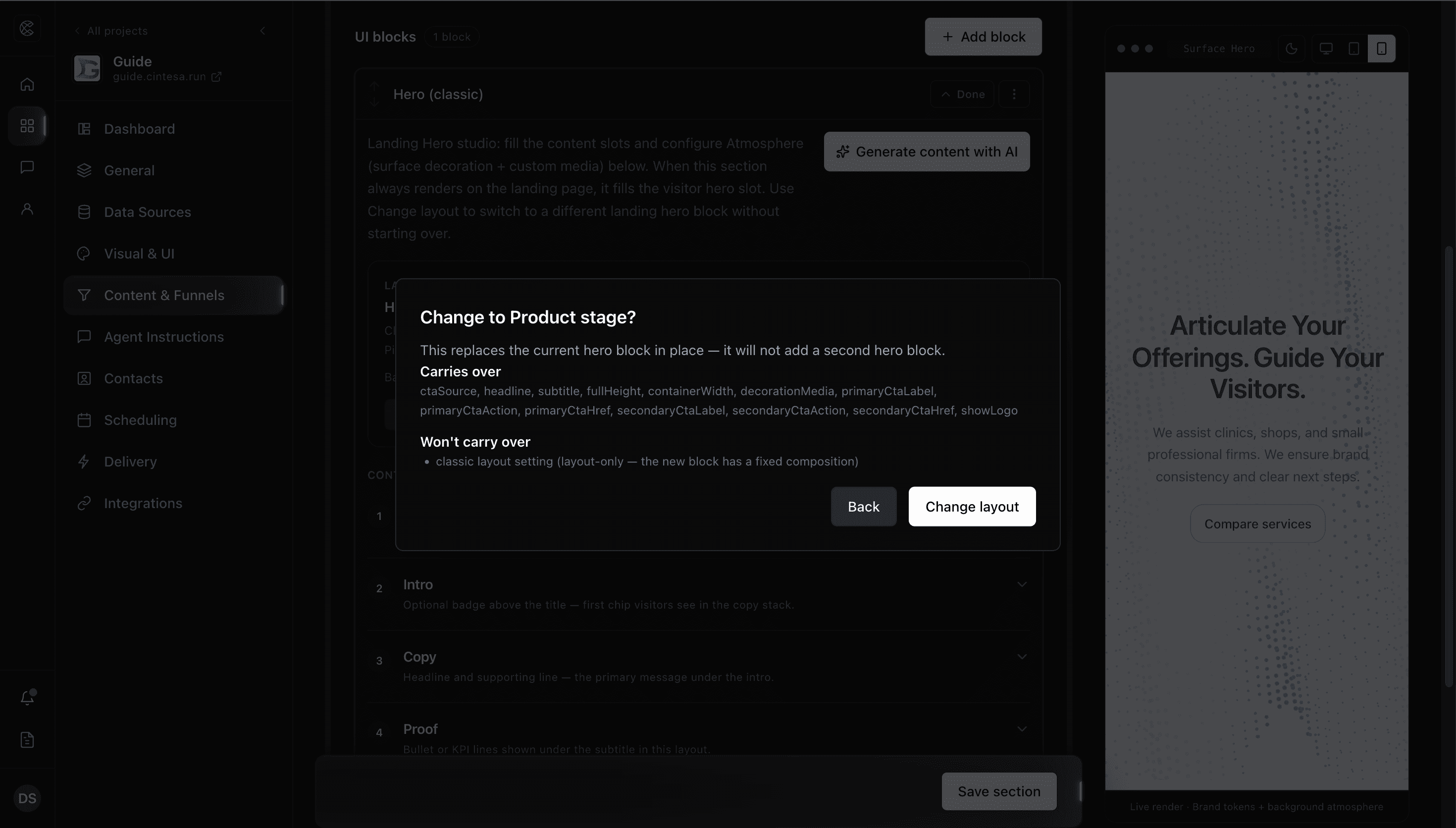
Typical carry-over includes badge, headline, rotating titles, subtitle, buttons, full-screen height, and media that the new layout can show. Slots the new layout does not have are listed under Won’t carry over — for example extra images, a Watch demo video, or a feature rail the target does not render. Atmosphere stays on the hero; you do not re-pick the background unless you want to.
Hero (classic) still has its own Frame control (Centered, splits, Editorial) for the original classic layouts. Use Change layout when you want a different hero block (Product stage, Media arc, and the other dedicated compositions).
A retired Chat-first hero still renders on existing sections. It is not offered for new sections. Change layout pre-selects Hero (classic) (recommended) so you can move off it without rewriting the copy.
When the section’s landing visibility includes a language landing or a traffic-rule landing, that hero fills the visitor first viewport for that composition. Full screen height keeps a stable screen height and centers the content — see Preview a section.
Library
Names below match the library cards. Change layout uses the same compositions with shorter titles (for example Product stage and Media arc).
Section means you place the block on a content section. Conversation means the agent can build that shape in a reply when instructions ask for it.
Landing heroes
These are first-viewport layouts. They are section-only. Pick one as the section’s hero block, or switch later with Change layout.
| Block | Purpose |
|---|---|
| Hero (classic) | Classic landing hero. After you add it, Frame picks Centered (promo and buttons above the conversation input), centered with three images, split image or media, or Editorial. Prefer a dedicated layout below for new work. |
| Hero Arc Carousel (Media arc in Change layout) | Centered badges, rotating title, and an arc-style media carousel. |
| Hero: Product stage | Centered copy, a framed stage window for one image or video, and a logo strip. |
| Hero: Portrait overlay | A cutout portrait over oversized type, with a motto and a framed KPI rail. |
| Hero: Photo modules | Full-bleed backdrop photo, a message column, status chip, buttons, and topic tags. |
| Hero: Cinematic focal | Background video, a centered media frame, a Watch demo popup, and split copy underneath. |
| Hero: Axial beam | Centered copy with a vertical light beam and stats on both sides. |
| Hero: Ribbon features | Left-aligned copy and trust logos beside a ribbon media frame and a feature list. |
Empty media frames still show a layout-accurate placeholder so the structure stays visible in preview and on the live site.
Layout
| Block | Purpose | Where |
|---|---|---|
| Promo Section | Full-bleed campaign banner with headline, supporting line, and two buttons. | Section |
| Feature Cards | Card row for products, services, or benefits. Each card can include an image and a button. | Both |
| FAQ | Accordion of questions and answers. | Both |
| Free Text | Headings, paragraphs, lists, and optional library media — no card chrome. | Both |
| Table | Column headers and rows for structured facts. | Both |
| Steps | Numbered process rail (how it works, onboarding, what happens next). | Both |
| Social links | Icon row of official profile URLs from General → Project Profile. The block is empty until those URLs are saved. | Both |
Conversion
| Block | Purpose | Where |
|---|---|---|
| Pricing | Plan or tier cards with price, features, and a per-tier button. | Both |
| Compare Pricing and Services | Side-by-side comparison with checkmarks, dashes, or text, and an optional highlighted column. | Both |
| Contact Form | Configurable visitor form. Mark a field sensitive when it should stay masked until an operator reveals it — see Contacts & forms and Visitor data & privacy. | Both |
| Appointment Scheduler | Stepped booking widget (service, person, slot). Plan-related feature on Pro or higher — turn scheduling on first. See Scheduling. | Both |
| CTA Buttons | A row of next-step buttons. Each button sends a prepared request to the agent. | Both |
Social Proof
| Block | Purpose | Where |
|---|---|---|
| Logo Cloud | Partner or customer logo strip. | Section |
| Stats & Metrics | Large figures with labels. Optional count-up when motion is on. | Both |
| Testimonials | Quote cards with attribution. | Both |
| Bio | Person profile: About (name, tags, portrait, optional download and personal social row), milestone timelines, and a chip cloud. | Section |
A Bio on the live landing is a curated section. In conversation, point instructions at that section rather than asking the agent to invent a biography layout.
Media
| Block | Purpose | Where |
|---|---|---|
| Product Details | Tabs above a split detail panel — copy and a button on one side, product media on the other. | Both |
| Media Box | One image or video in a fixed ratio, with optional caption and full-view. | Both |
| Media Carousel with Thumbnails | Ordered slides with a main frame and a thumbnail strip. | Both |
| Bento Grid Media Library | Multi-cell library grid that keeps each asset’s aspect ratio, with optional full-view browsing. | Both |
| Fade Carousel | Cross-fade slideshow for a page section. | Section |
| Scale Carousel | Slideshow with a larger active slide and smaller neighbors. | Section |
Full-view on the media library blocks opens a gallery with captions and previous/next. In the section preview it stays inside the device frame.
Conversation-only
| Block | Purpose |
|---|---|
| Page Section | Shows a content section you already saved, by its tag. You do not add this from New section — use @page_section: in Agent Instructions when the packaged section should appear as authored. |
Retired
Hero: Chat-first is no longer offered. It matched Hero (classic) with the Centered frame. Existing sections still render. Use Change layout to move to Hero (classic) or another composition.
Agent Instructions ids
When you want the agent to compose a library shape for this turn (not replay a saved section), insert @ui-block: from the @ menu. Examples:
| Block | Token |
|---|---|
| Feature Cards | @ui-block:feature_bento |
| Product Details | @ui-block:product_demo_tabs |
| Stats & Metrics | @ui-block:stats_counters |
| FAQ | @ui-block:faq |
| Testimonials | @ui-block:testimonials |
| Pricing | @ui-block:pricing_table |
| Contact Form | @ui-block:lead_capture_form |
| Appointment Scheduler | @ui-block:appointment_scheduler |
| Free Text | @ui-block:free_text |
| CTA Buttons | @ui-block:cta_buttons |
| Table | @ui-block:data_table |
| Compare Pricing and Services | @ui-block:comparison_table |
| Steps | @ui-block:steps |
| Media Box | @ui-block:media_box |
| Media Carousel with Thumbnails | @ui-block:media_carousel_thumbnails |
| Bento Grid Media Library | @ui-block:media_bento_grid |
| Social links | @ui-block:social_links |
| Page Section | @ui-block:page_section |
Do not invent an id. Do not leave the raw token in visitor-facing copy — visitors see the rendered block.
Related
- Content & Funnels — sections, preview, Funnels, Live surface
- Atmosphere — landing hero background
- Visual & UI — theme and page layout
- Agent Instructions — when the agent should show a section or compose a block
© 2026 Cintesa. Guide text and screenshots are Cintesa product materials for personal and operator use. Do not scrape or republish them commercially without permission. Terms of Service · Privacy Policy.